The Treemap Problem
It’s a rectangle. Inside that rectangle, there are smaller rectangles. How hard can it be?
A treemap is a simple idea. You have a canvas. You have a set of files, each with a size. You want to show them all at once, where the visual area of each element is proportional to its file size. The whole canvas is always full. Nothing is wasted.
Ben Shneiderman described the basic concept in 1992 at the University of Maryland. The idea is elegant because it solves a real perceptual problem: humans are good at comparing areas. A pie chart can show you twelve items before it becomes unreadable. A treemap can show you five thousand items and still communicate the big picture.
The core invariant is area equals size.
The naive approach
The naive implementation is a simple recursive slice. Take a rectangle. Split it horizontally into N strips, one per child, each with height proportional to its size. If a child has its own children, split its strip vertically. Continue recursively.
This works. The areas are correct. The math is three lines.
It also looks terrible.
A directory with ten files of roughly equal size becomes ten horizontal strips, each about five hundred pixels wide and twelve pixels tall. You cannot read the labels. You cannot click individual items accurately. The rectangles are not shapes so much as lines. Aspect ratios of 40:1 are common.
Naive slice: 10 equal-sized files in a 500×200 canvas:

┌──────────────────────────────────────────────────┐ ← 500px wide
│ file-01.dmg (20px tall)                          │
│ file-02.mp4                                      │
│ file-03.zip                                      │
│ file-04.pkg                                      │
│ ...                                              │
└──────────────────────────────────────────────────┘
  Aspect ratio per strip: 25:1. Unreadable.
A thin strip has the right area but the wrong geometry. You need both.
The squarified algorithm
The squarified treemap algorithm addresses this directly. It was published by Mark Bruls, Kees Huizing, and Jarke van Wijk in 1999: the paper, “Squarified Treemaps”, is short enough to read in an afternoon. The goal is to keep aspect ratios close to 1. Not exactly 1, because the areas still have to sum correctly, but as close as the math allows.
The algorithm processes children in order of decreasing size. It maintains a current “row” of items being laid out along one edge of the remaining space. For each new item, it asks: if I add this item to the current row, does the worst aspect ratio in the row improve or get worse? If it improves, add the item. If it gets worse, commit the current row, allocate its strip from the remaining space, and start a new row.
graph TD
    A[Sort children by size desc] --> B[Start new row]
    B --> C[Try adding next child]
    C --> D{Would worst aspect ratio improve?}
    D -->|yes| E[Add to current row]
    E --> C
    D -->|no| F[Commit current row as laid-out rectangles]
    F --> B
    E --> G{More children?}
    G -->|no| H[Commit final row]
Try it directly: drag the sliders to change relative file sizes and watch both layouts update in real time.
The result is a layout where most rectangles are reasonably square. Never the 40:1 strips of the naive approach.
This is a twenty-five-year-old algorithm. It still works because rectangles have not changed.
The first render
The first working render was a milestone. I had a scanner that traversed the filesystem, a squarified layout engine that turned a tree of file sizes into a flat list of rectangles, and a SwiftUI Canvas that drew them. The coordinates were correct. The areas were correct. Every file on my disk had a rectangle.
It looked like a spreadsheet with delusions of grandeur.
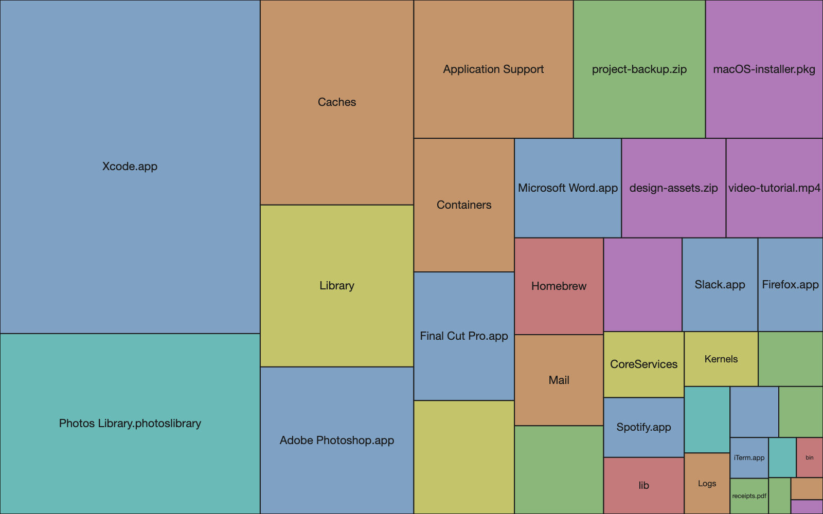
The rectangles were flat, solid colors, arranged in a grid. Each rectangle had a hard edge and a label. The visual impression was a table, not a visualization. There was no sense of hierarchy, no depth, no way to immediately grasp that some rectangles were containers and others were leaves. The information was there, technically. The perception was not.
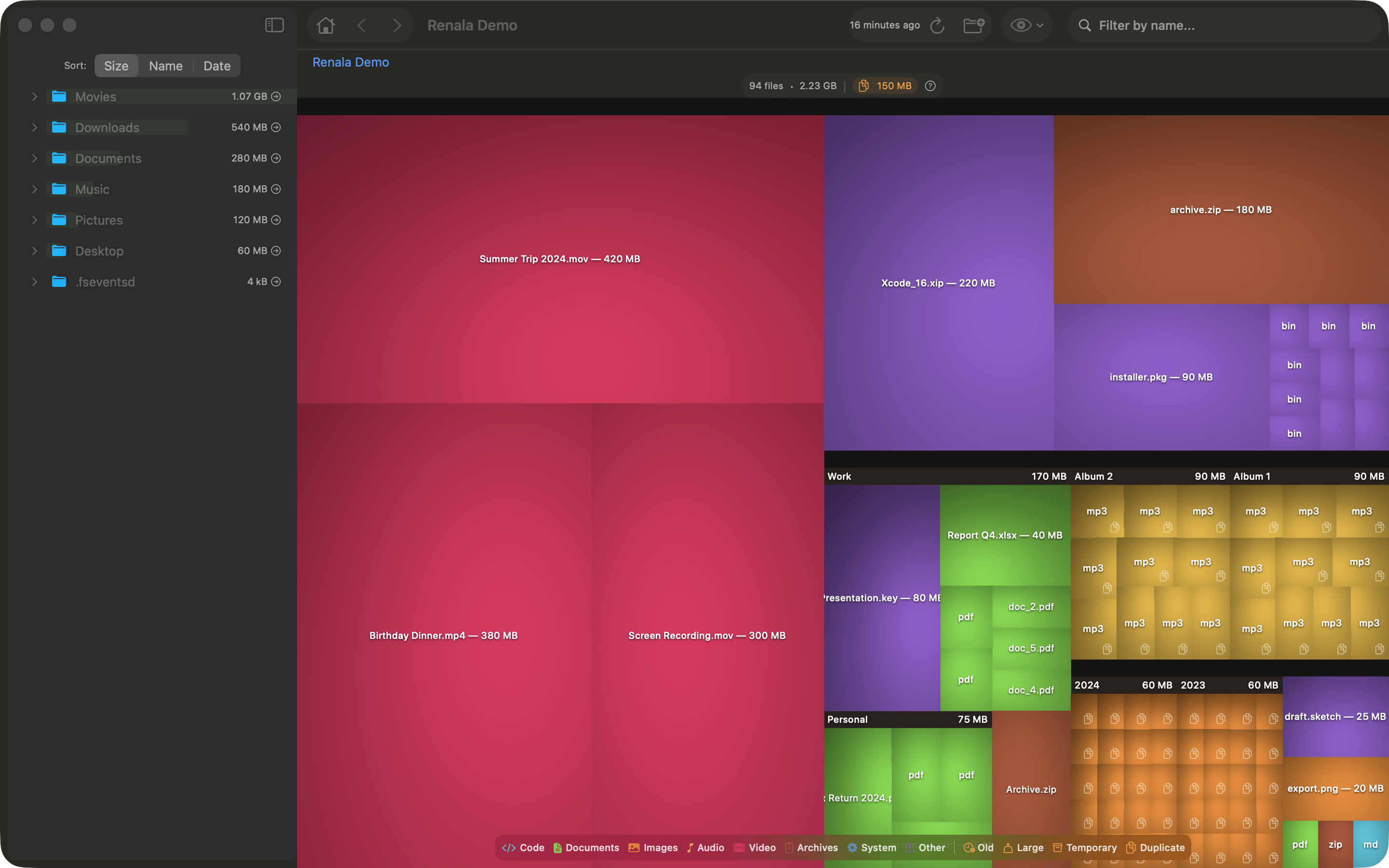
Cushion shading
The fix comes from the same era as the layout algorithm. Jarke van Wijk and Huub van de Wetering described it in their 1999 paper “Cushion Treemaps: Visualization of Hierarchical Information”, and the core idea is physical: make each rectangle look like it has depth.
Each rectangle is modeled as a slightly convex surface, like a seat cushion. Highest at the center, lower at the edges. A virtual light source illuminates this surface from above and to one side. The shading is computed per pixel using Lambert’s cosine law: brightness at any point is proportional to the cosine of the angle between the surface normal and the light direction. The math is basic 3D lighting. The visual effect is dramatic.
graph LR
    Q["Quadratic surface<br/>h(x,y) = ax² + bx + ay² + by"] --> N["Surface normal at pixel<br/>nx = −(2ax + b)<br/>ny = −(2ay + b)<br/>nz = 1.0"]
    L["Light direction<br/>(lx, ly, lz)"] --> D["Dot product<br/>max(0, N · L / |N|)"]
    N --> D
    D --> I["Intensity<br/>0.0 – 1.0"]
    BASE["Base color<br/>(file category)"] --> OUT["Pixel color"]
    I --> OUT
Nested rectangles accumulate cushion parameters from their ancestors. A file inside a directory inherits the parent directory’s cushion parameters and adds its own on top. The result is that directory boundaries become visible as subtle ridges in the shading, without drawing any borders. The nesting structure is physically encoded in the light and shadow.
graph TD
    ROOT["Root cushion params<br/>ax=small, bx=0"] -->|inherited + scaled| DIR["Directory cushion<br/>ax=medium, bx=offset"]
    DIR -->|inherited + scaled| FILE["File cushion<br/>ax=large, bx=offset"]
    FILE --> PIXEL["Per-pixel brightness<br/>highest at center, darker at edges"]
After adding the shading, it looked like a disk analyzer.
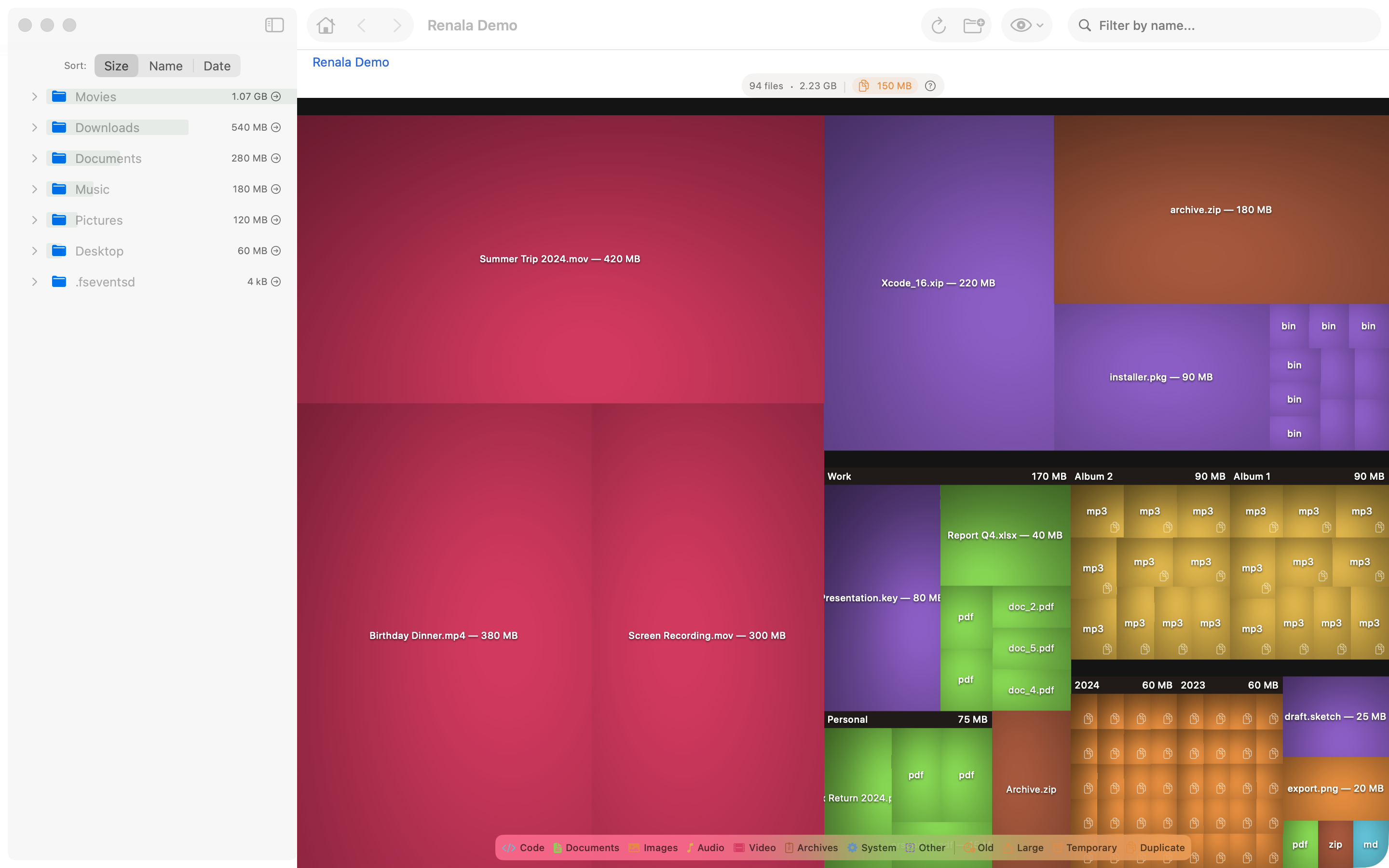
The flat version was correct. The shaded version was useful. Correct and useful are not the same thing, and nobody has ever been excited about correct.
Why shading encodes hierarchy
Without shading, a directory full of small files looks like a mosaic of colored squares. You see files. You do not see the directory they belong to. The shading changes that: files inside a directory sit in the shadow of the parent cushion, so the container becomes visible as a container.
The eye reads depth from shading before it reads labels. The hierarchy is visible before you read a single filename.
Two problems, two old solutions
The treemap problem turned out to be two problems: layout and rendering. Both had good solutions from 1999. Both were in published papers I could read in an afternoon.
The hard parts of building a new application are often not new problems. They are known problems you have not encountered yet. The squarified algorithm is in a paper. The Lambert shading is in any graphics textbook: the Wikipedia article on Lambertian reflectance covers the mathematics concisely. The work is in finding the right source, understanding the constraints, and applying the solution to your specific situation.
What looks like a rectangle problem is usually a reading problem. The rectangle was fine. You just had not read the paper yet.
References
- Bruls, M., Huizing, K., van Wijk, J.J. (1999). Squarified Treemaps. Proceedings of the Joint Eurographics and IEEE TCVG Symposium on Visualization.
- van Wijk, J.J., van de Wetering, H. (1999). Cushion Treemaps: Visualization of Hierarchical Information. IEEE Symposium on Information Visualization.
- Shneiderman, B. (1992). Tree visualization with tree-maps: 2-d space-filling approach. ACM Transactions on Graphics.
- Wikipedia: Treemapping, Lambertian reflectance